Modernizing an account configuration process for back-office bank employees.
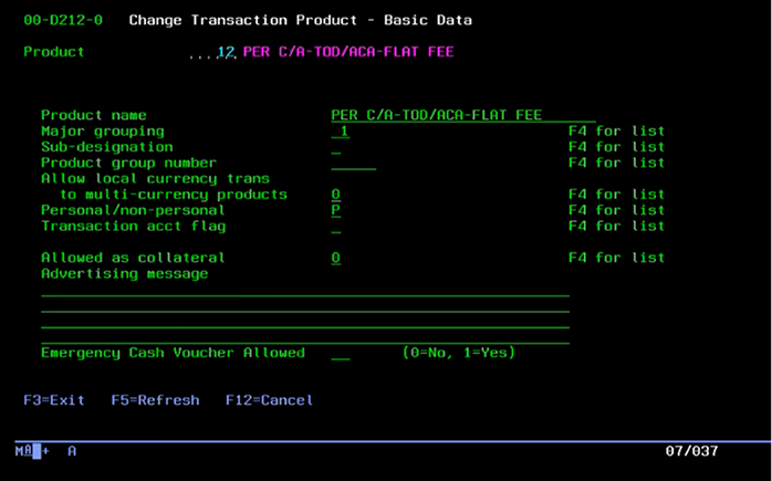
Relying on a tedious and outdated legacy system
Setting up checking accounts for customers is a vital responsibility of back-office bank employees. Each checking account product has different rules and parameters defining how the account works.
Using outdated legacy green screens with limited flexibility and functionality slowed down the process greatly, introduce more room for error, and created a frustrating user experience.
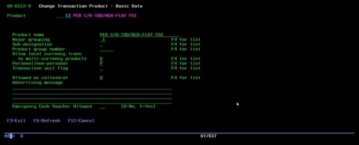
Their old legacy system relied on manual keyboard navigation and required users to complete the entire process in one sitting.
The tip of the iceberg
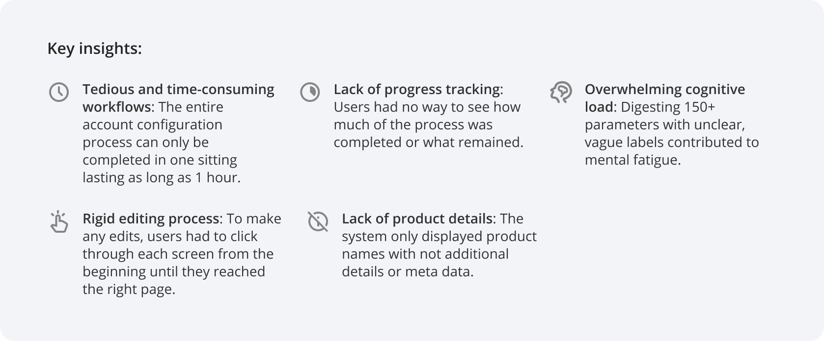
From what was gathered in initial conversations with the team, there were some factors to address.
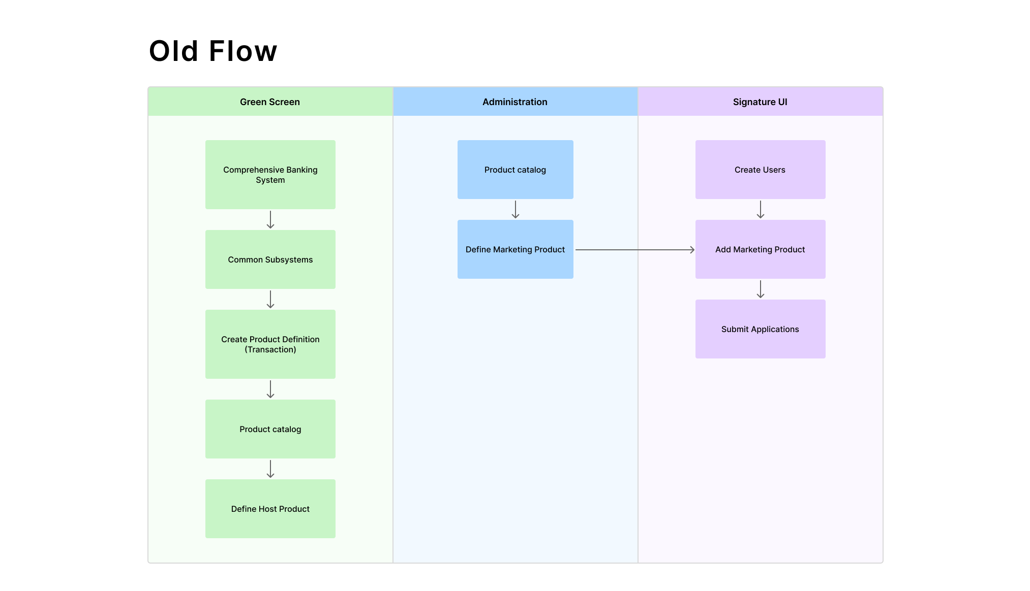
- Multiple interfaces – The account configuration process was housed in these legacy green screens while other actions and processes were in a different platform, making it frustrating to navigate back and forth every time.
- Constant dependence on documentation – Parameter values were displayed as numbers (1-9) without any descriptions, requiring employees to constantly refer to separate documentation which could be well over hundreds of pages. And parameter labels without descriptions created confusion delaying the process further.
- Little flexibility – Users weren't allowed to skip steps or go back, forcing them to restart if a mistake was made.
- External consulting – In some cases, employees would need to consult with other Fiserv associates for additional guidance, further delaying the process.
The goal
As a result, we were looking to build a self-service workflow for account configuration that bridged gaps and improved operational efficiency.
Listening to user concerns
However, we were only seeing part of the bigger picture, so we started off with testing the green screen interface ourselves and conducting interviews with 6 back-office employees who used it daily.
Artifacts
Constructing a task analysis and user flow helped to visualize where the account creation process fit in the user's journey, addressing friction points along the way.
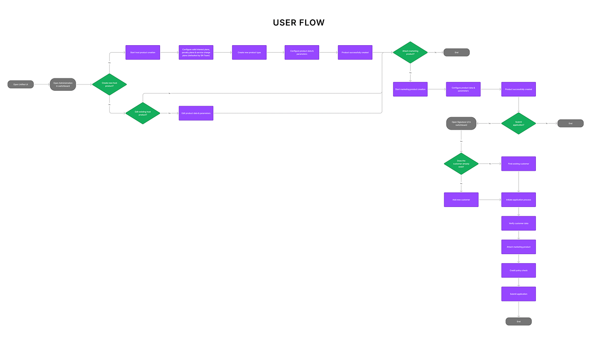
Built s new journey that offered flexibility and bridged disconnected tasks into one workflow.

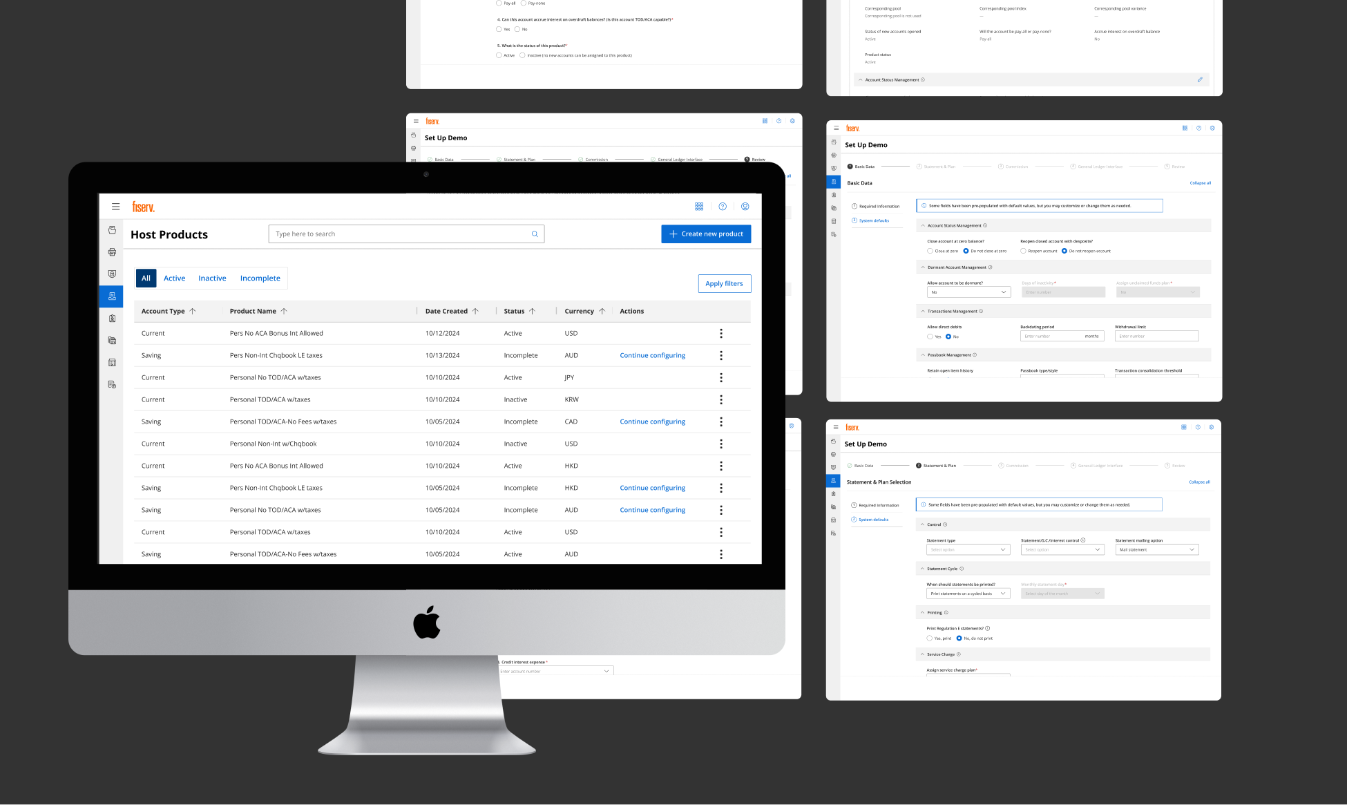
Designing a simplified and manageable experience
I designed the workflow focusing on the insights gathered from research, ensuring every decision was driven by user needs and data.
.png)
The designs were built with one of Fiserv's design systems called APEX suited for utility and function.
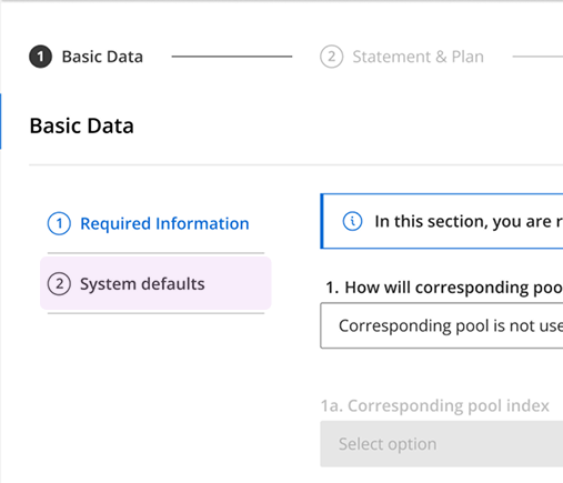
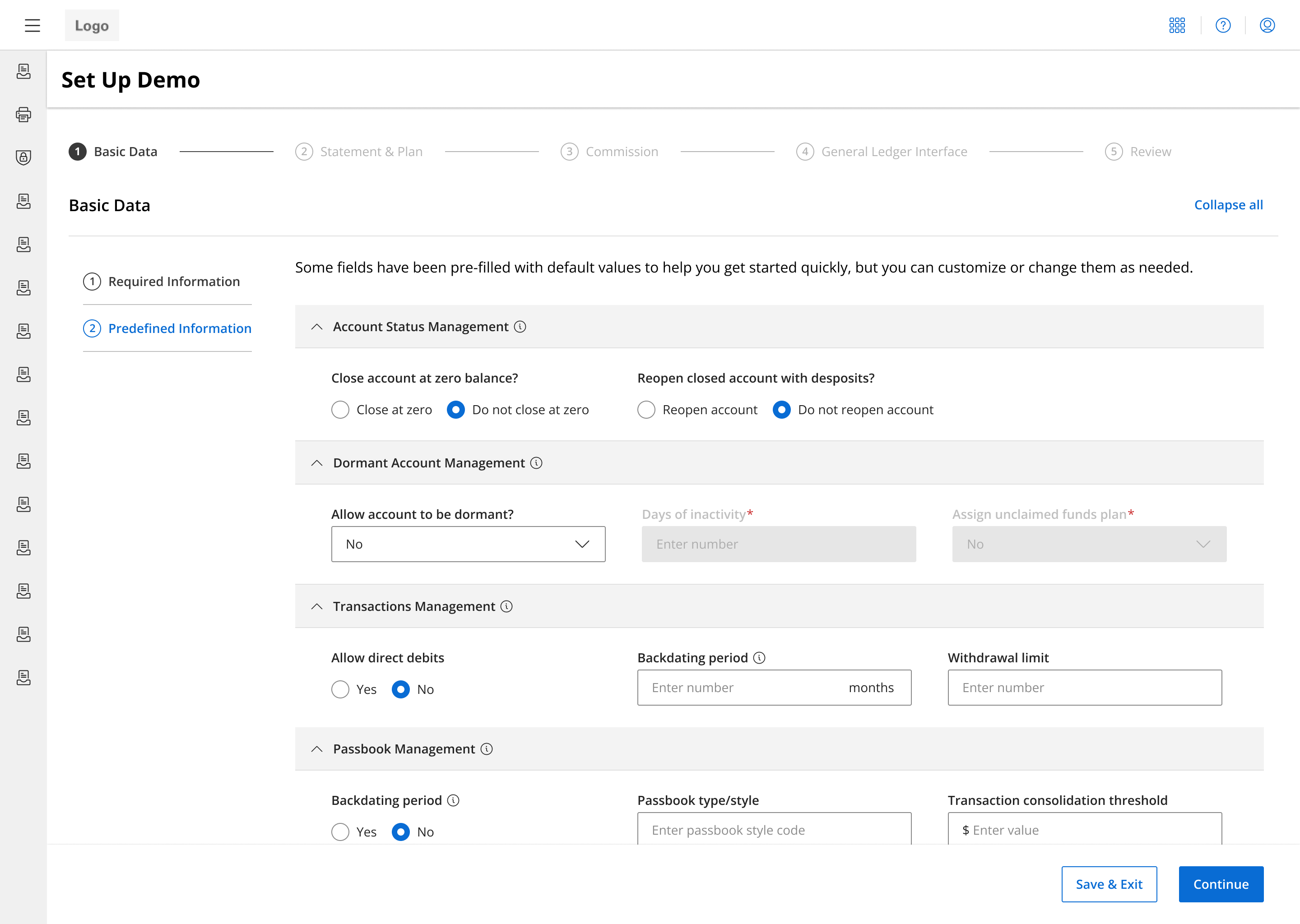
Categorization & progressive disclosure
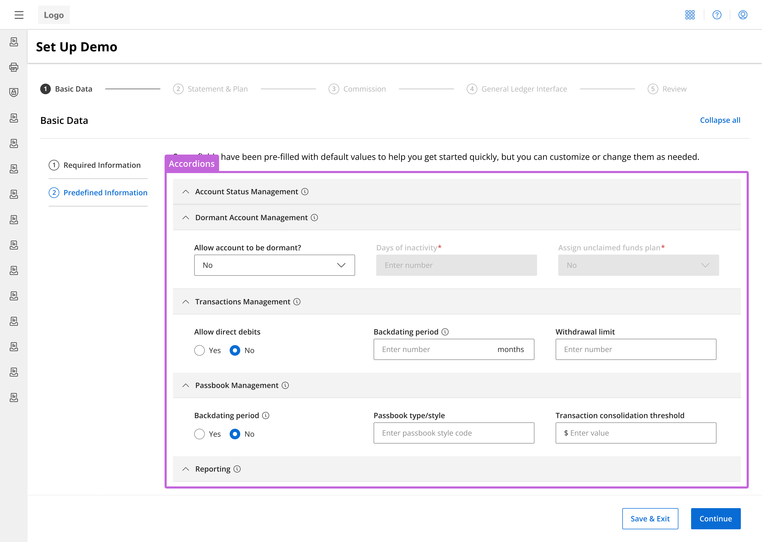
Eased the challenge of presenting 150+ parameters without overwhelming users by breaking them into more digestible chunks within each step.
- Conducting card sorting exercises helped group related parameters, and turning these groups into accordions gives users more control of how much content they can see at a time.
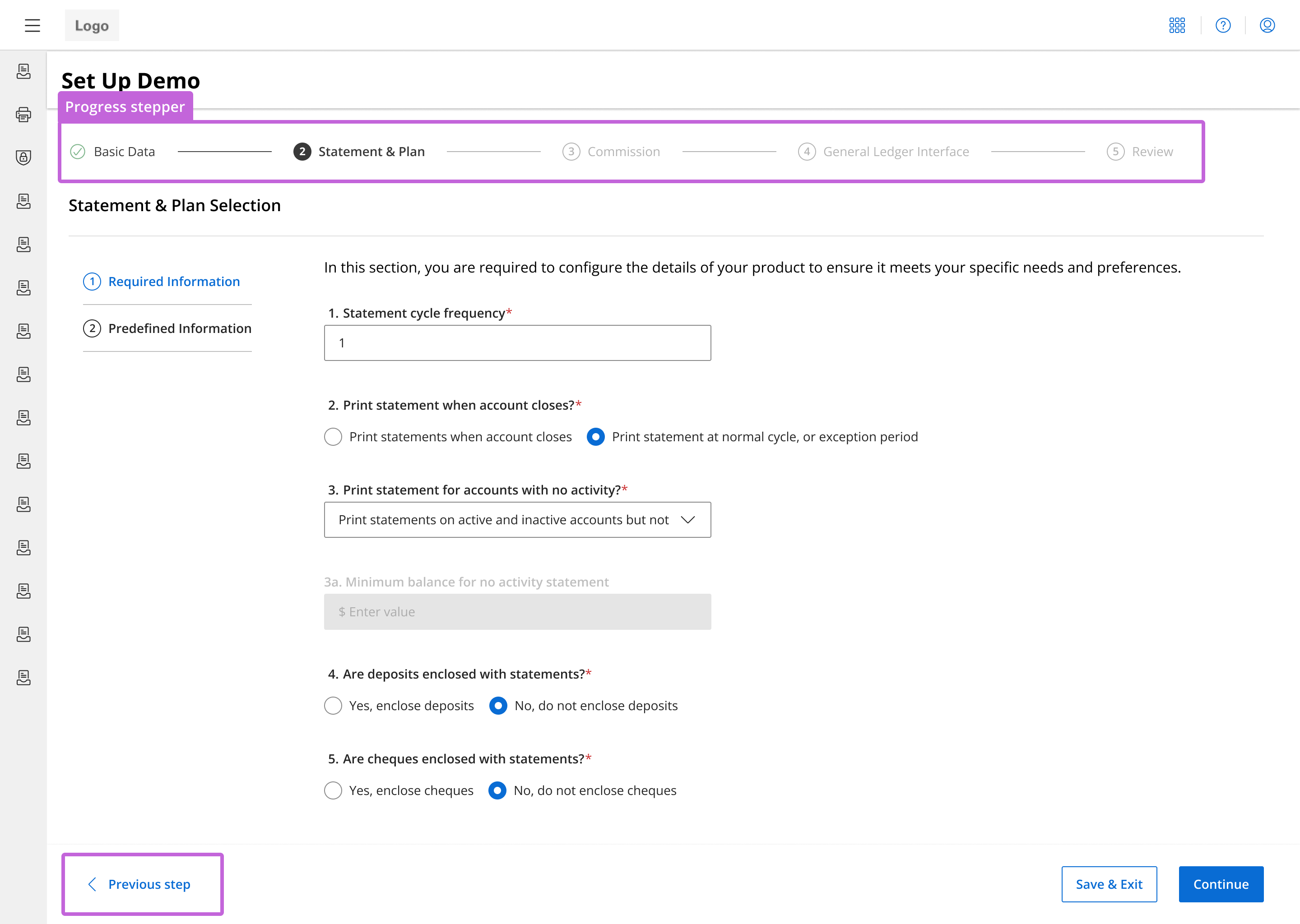
Progress visibility & flexible navigation
Addressed the lack of visibility of status progress and the concern of being unable to navigate back to previous sections.
- A step progress bar informs users of what steps they've completed, where they are in the account configuration process, and what remains.
- Users can go back to previous steps through the progress bar at the top or by clicking "Previous step" without having to restart the whole flow.
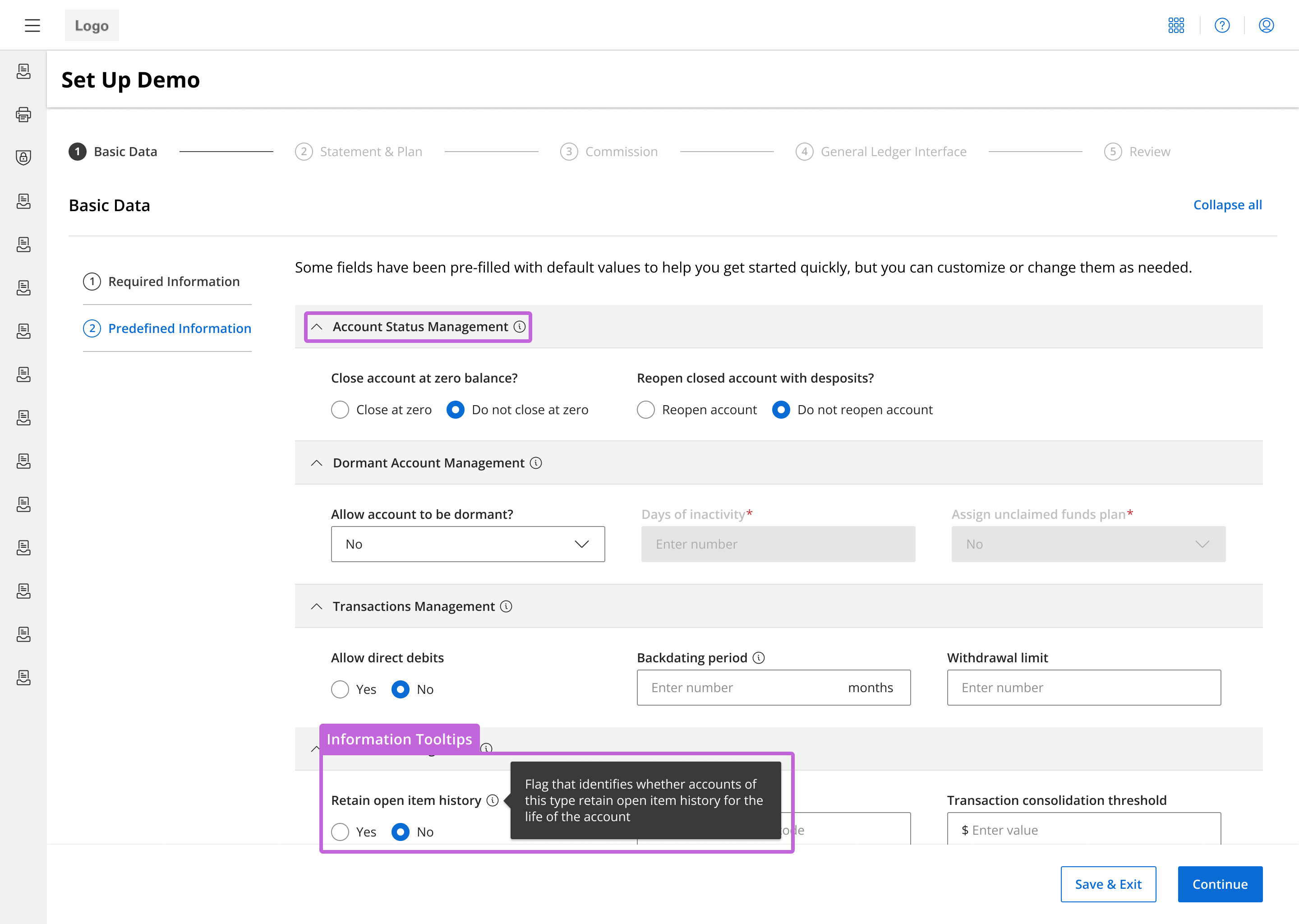
Clearer parameter labels & tooltips
Clarifying parameter names and providing additional information right when it's needed saves users from spending unnecessary time searching through hundreds of pages of documentation and consulting help from other teams.
- Worked with SMEs to rewrite vague labels to be clearer and included tooltips and info icons for parameters and sections that needed additional detail.
- Divided parameters based on whether it was a required parameter, so users will see and fill all required fields first.
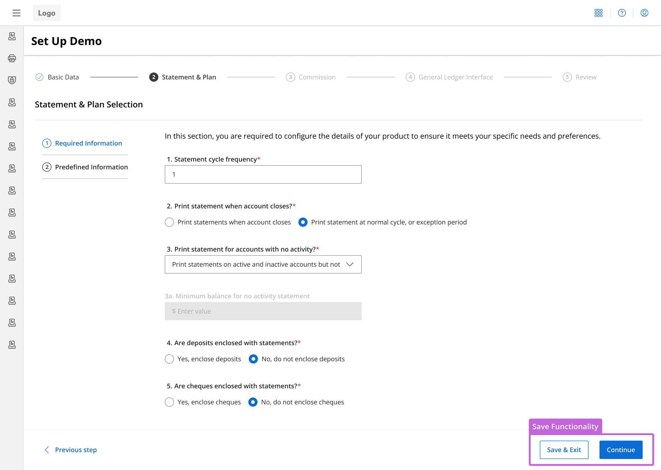
Save & Continue functionality
Users can stop their progress and continue where they left off, eliminating the pressure of completing the process in one continuous session.
- Users can click 'Save & Exit' which will save their progress and take them back to the catalog page with the list of existing checking account products. When they want to resume, they will return to where they last stopped.
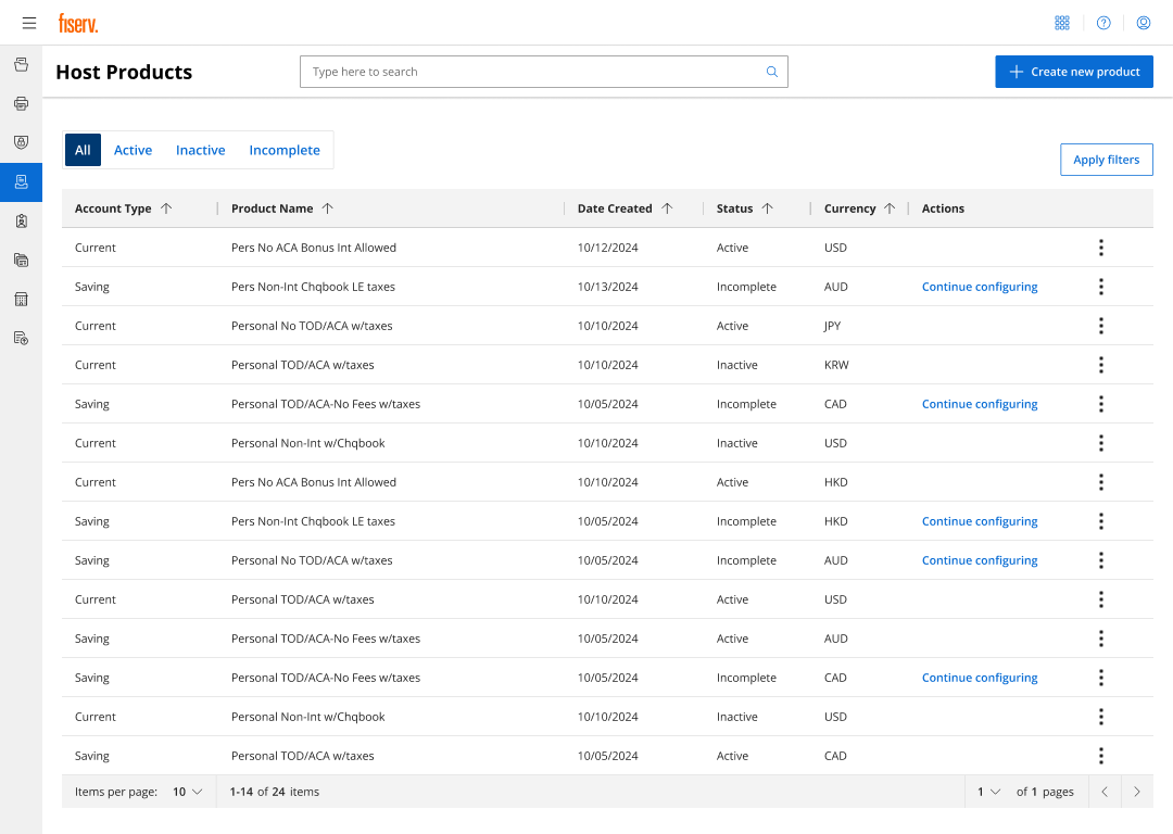
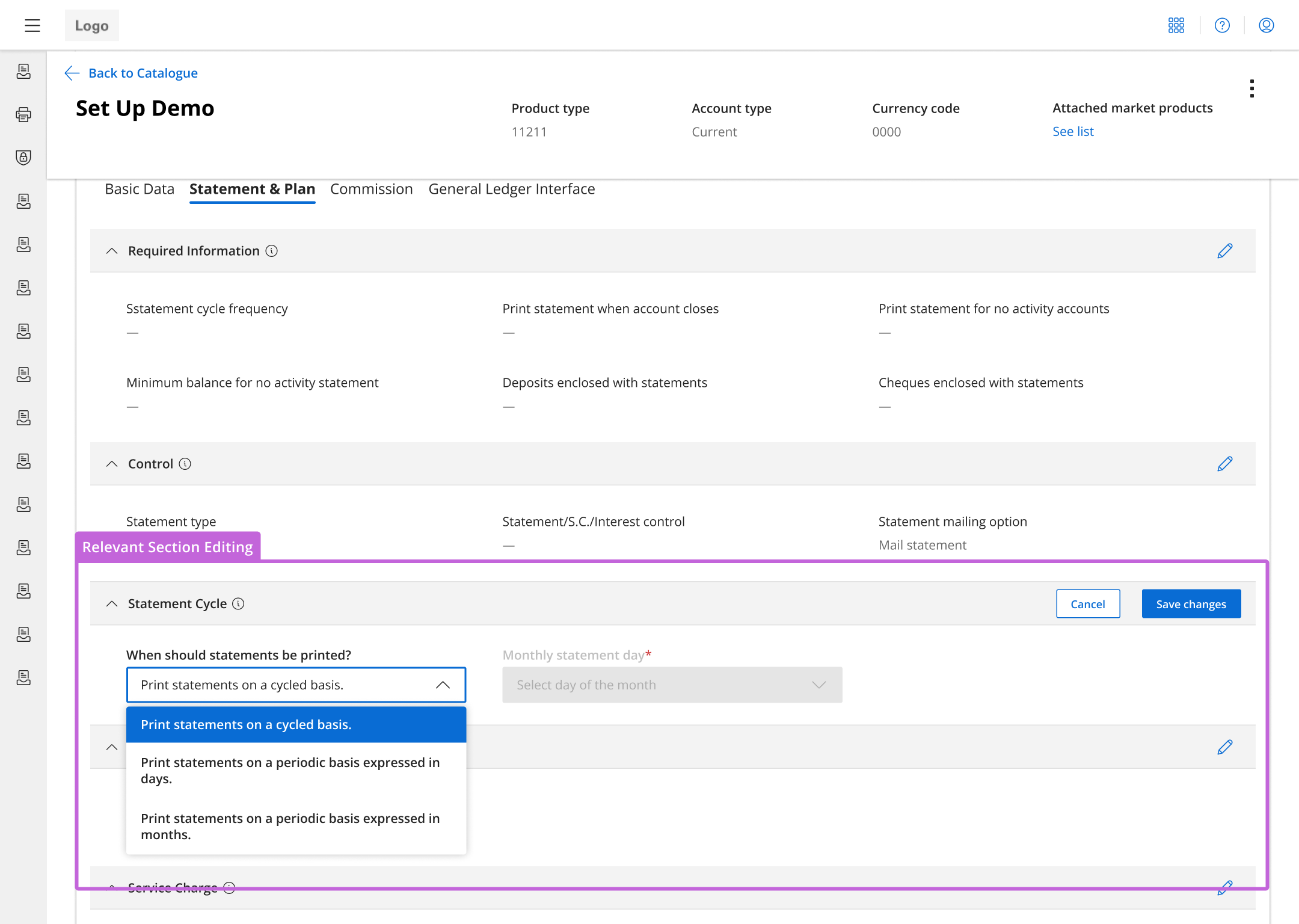
Enhanced editing & product overviews
Make the search for configurations easier and faster with sortable values and allowing editing by sections.
- Formatted the products into a table with column headers for easier searching.
- Organized information into tabs for editing only relevant sections.
- Edit in smaller groups as needed rather than search through and edit one parameter in an entire category.
Refining the experience
To ensure the new design was targeting the right needs, I conducted 8 usability tests on five direct users and three internal Fiserv employees who would assist these users. Users gave positive, with many praising the improvements and expressing increased satisfaction with the new system. However, there were some areas where participants seemed to have a little difficulty and made improvements.
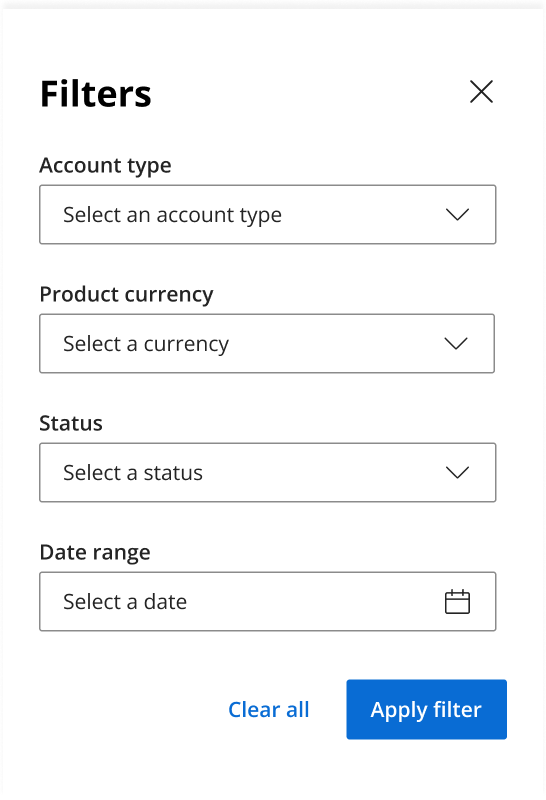
Filtering modal
Sorting arrows weren’t enough for users. They wanted drop-down filters to quickly find specific configurations.
Expanded flexibility of actions
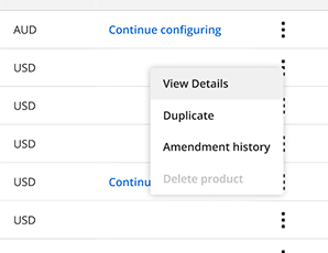
Some users were unaware that they could click on a row in the table to view more details, so a "View Details" option was added.
Enhanced visibility
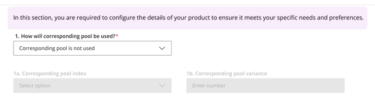
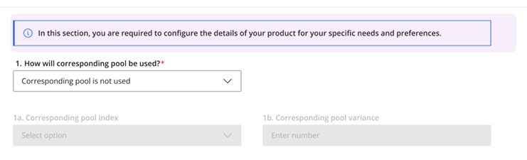
The instructive description at the top was converted to a toast notification to make it more noticeable since participants often glossed by it.
Copy clarification
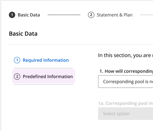
Users also seemed to be confused by the term "Pre-defined Information" for parameters that were defaulted, so it was changed to "System Defaults" for clarity.
Final prototype
This short preview shows part of the new account configuration experience.
A quicker, more efficient system
After weeks of work, I built a faster process with an observable 40% decrease in configuration time thanks to a modernized UI and streamlined process.
- Users praised the new, modern interface and intuitive workflow.
- Reduced cognitive overload by grouping parameters, providing visibility into progress status, and updating old components.
- Removed reliance on 100+ pages of documentation and outside resources.
Reflections
This project was not only an exploration of modernizing old banking tools but also designing for efficiency without the unnecessary fluff.
- Push back fixed thinking: When changing the approach to categorizing the parameters, it opened up a whole set of ideas that stakeholders loved.
- Advocating for UX: The stakeholders knew little of the design process, so we carefully described our rationale for our designs and informed them of best practices in UX.

