Enhancing the self-service experience to resolve customer inquiries efficiently and quickly.
1 Product Manager
Increased clarity in error recovery
The error message tells the user to contact their system admin to help set up their account. For a new user, it may not be clear who the system admin is or how to reach them.

Suggested Improvement
Providing a guided user tour
Trainings are provided to understand the platform and how to use it, but oftentimes vey little of the information is retained. When users arrive at this screen, they are at a loss of what to do next.
Suggested Improvement
.svg)

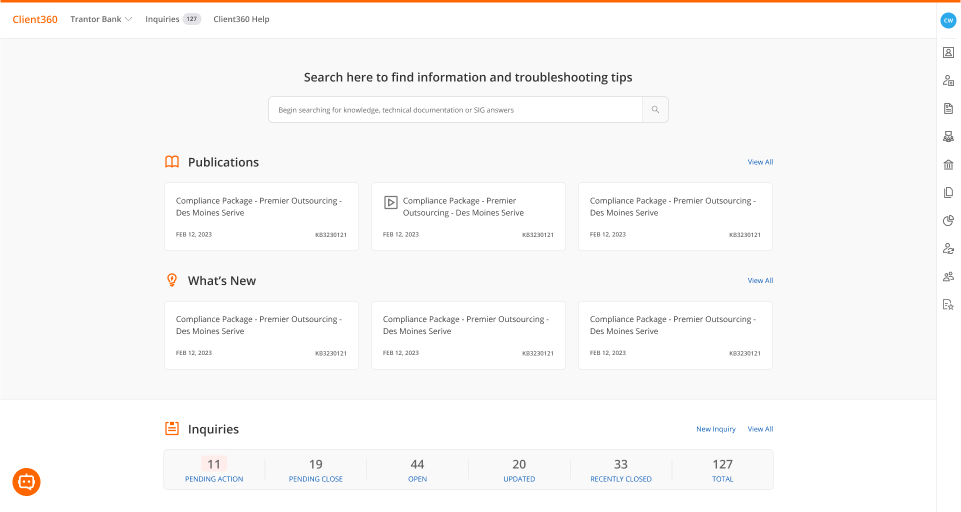
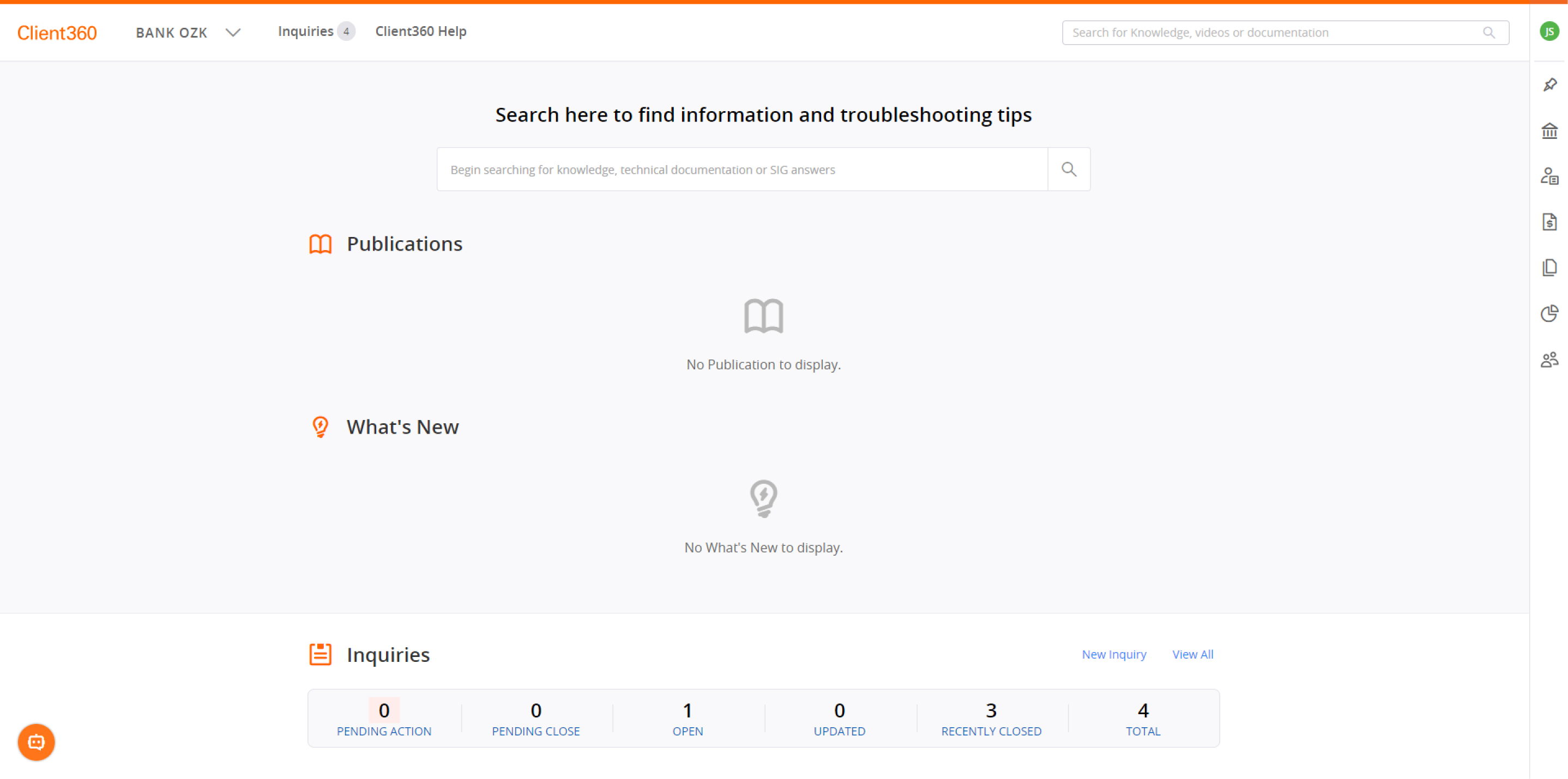
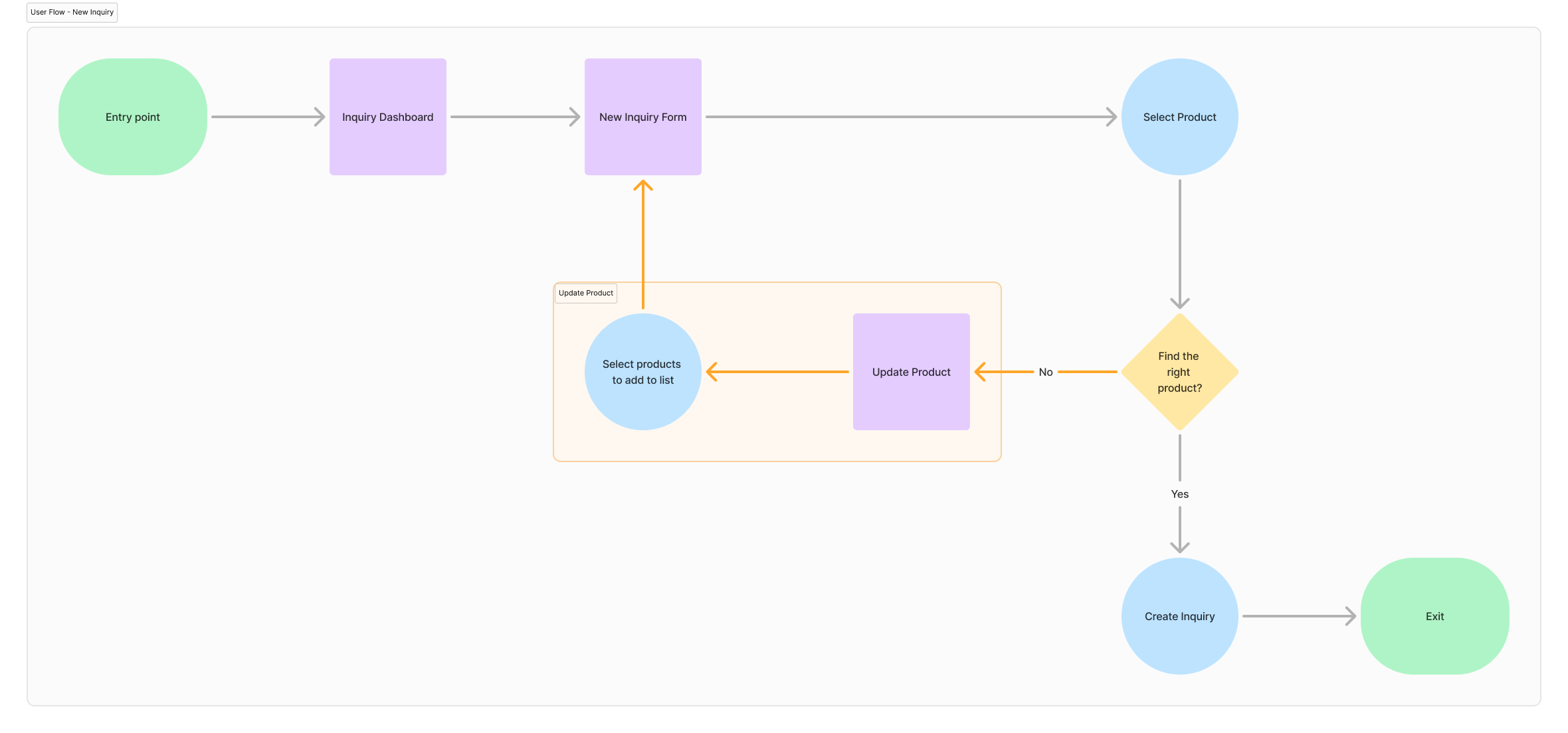
Building a flexible and connected workflow
A common action users will likely take is creating an inquiry and specifying which product they are having an issue with. However, as a first time user, the 'Product' dropdown will appear empty.
A quick fix to the problem was embedding an informational banner about what to do at the top of the form, but it was found that users often overlooked it. Adding onto the problem, users had to exit the form to configure their product settings and then go back to create a new inquiry again, losing any of their progress.
.png)
How do we address users overlooking the help text without leaving the inquiry form?
Suggested Improvement

.svg)
Lack of meaningful visual hierarchy
Any edit or update that is made within the platform is recorded with the details of that change. It's important that users can quickly find what they need , so they can move on to the next task.

.svg)
.svg)

